We’re all creatures of habit, which means we can easily get in the groove of using a project management tool the same way over and over. And there are so many project plan goodies tucked away in LiquidPlanner, you can almost forget to take advantage of some of them. Here’s one we want to remind you about:
The View Menu.
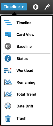
Our public service announcement to customers this week is, “Don’t forget to click Timeline!” This is the open-sesame move to access the View Menu and interact with your project schedule on a number of different levels.
So come with us, we’re going to take you on a tour of your View Menu goodies.
Timeline:

To start, the Timeline view is your default view of the LiquidPlanner schedule bars. It shows project progress and status overview that includes active work, done work, milestones, delays and dependencies.
Card View:
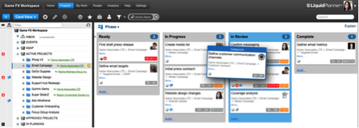
For tech teams that like using Kanban boards, and anyone who’s a visual thinker, Card View is a three-dimensional way to process data and cycle through projects.
Card View is a simple way to manage the execution of projects and tasks using a board display. It’s a perfect fit for any Agile process because it makes it easy to categorize and prioritize items, giving you visual control over your work.
Baseline:

The Baseline View lets you compare the current status of your plan to a specific date in the past. This gives you the ability to see if your plan is keeping pace with earlier projections, exceeding them, or falling behind. Part of what Baseline does is let teams look back in time so they can better understand the details of a project’s progress. Our Baseline feature lets you snap a manual baseline, and create a baseline comparison using a manual or automatic snapshot.
Status:
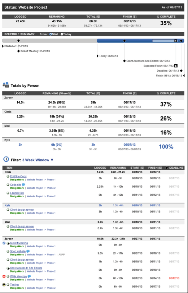
Your Project Status Report gives you the most vital details about a project, package or sub-folder. It shows you hours logged, hours remaining, percent complete, tasks, milestones and totals by person. You can print the report by clicking the printer icon while in full-screen mode.
Workload:
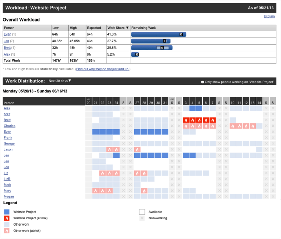
The Workload Report shows you remaining hours on project work. A couple specifics:
The Work Distribution chart shows you if a person has work scheduled on a given day.
The Overall Workload graphic shows you how the remaining hours are distributed across your team members, which is a super nifty tool for manual load balancing. You can print the report by clicking the printer icon while in full-screen mode.
Remaining:
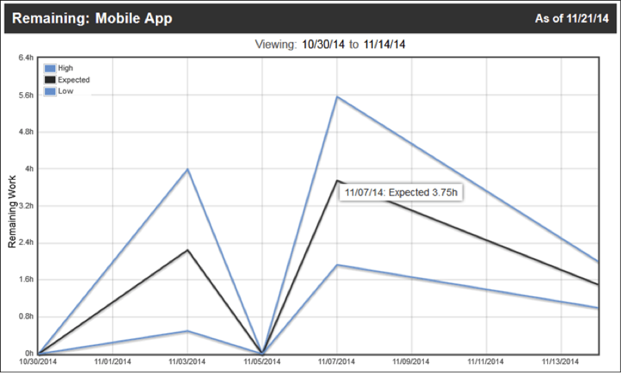
The Remaining Trend Report is also known as a burndown report. It shows the estimated remaining work over time, plus a projection to the probable landing zone. Pick a point on any line and the cursor popup will show you what the expected remaining effort for the project was as of that point in time. You can print the report by clicking the printer icon while in full-screen mode.
Total Trend:
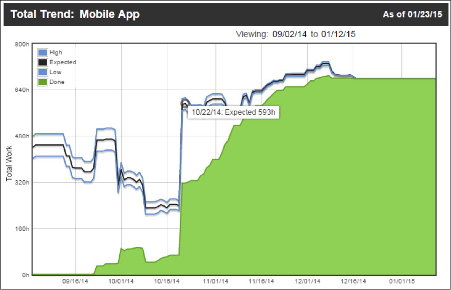
The Total Trend Report plots the total work (remaining effort plus logged progress) over time, so you can see the work expanding and contracting both in total work and range of uncertainty. The growing green mountain is the actual work done. You can print the report by clicking the printer icon while in full-screen mode.
Date Drift:
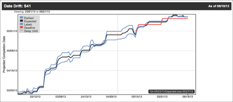
The Date Drift Report, a.k.a slip report, is like the clear light of morning streaming in an hour too early. It shows you where your project was expected to exit at any point in its lifetime. Pick a point on any line, then watch the black box in the lower right to see what the projected finish date for the project was as of that point in time. You can print the report by clicking the printer icon while in full-screen mode.
Trash:
This is where you can go to see or access everything that’s been deleted from your workspace. You can also delete or undelete all selected plan items from here.
What LiquidPlanner feature or functionality have you recently integrated into your planning work?


